Responsive Website Design

Project Info 2
Responsive Website Design
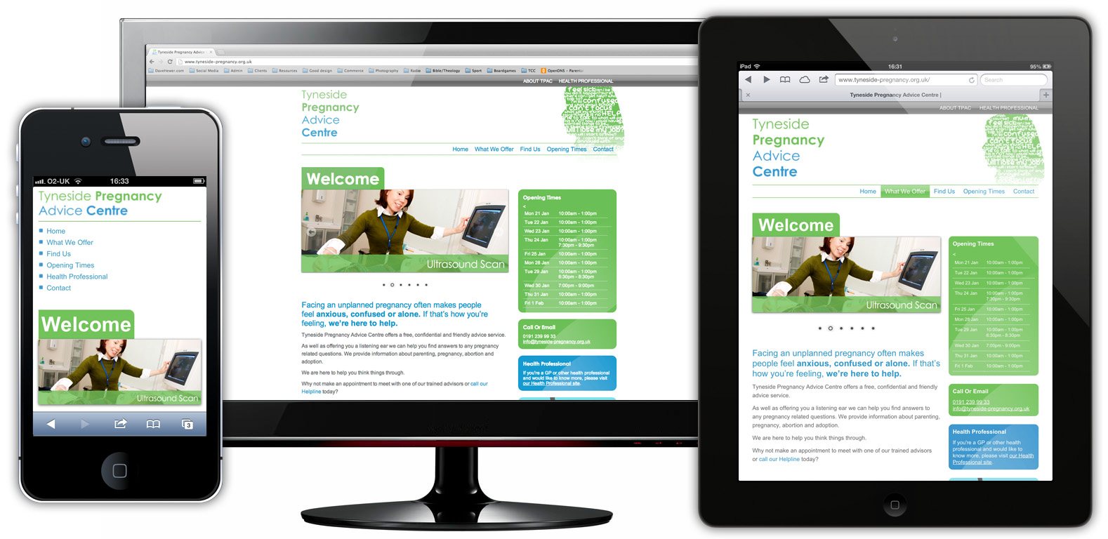
I was approached by an existing client to redesign their site and particularly implement a responsive website design. Responsive website design means that the content of the site automatically adjusts it’s appearance depending upon the screen size of the device it’s being viewed on. In this way, the user gets a tailored, engaging experience whether they’re looking at the site on a 30″ monitor or an iPhone.
Brand development
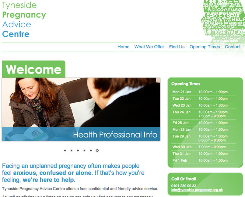
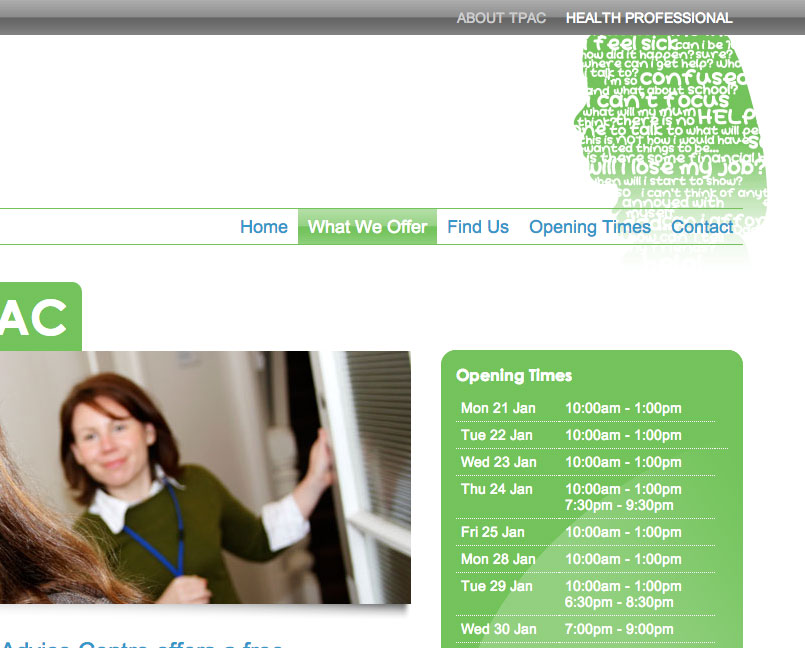
Because this was a redesign and not a brand new project, it was important that the existing brand and broad site structure was carried across. Keeping the existing colours and iconic ‘head’ image that had been used on existing promotional materials. At the same time, the site design was significantly improved through simplifying the layout and navigation system.
WordPress Integration
The clients also requested to have a method of easily making updates to the content of the website. As with many of my websites, I integrated the website completely into WordPress, an established content content management system. I also gave the key client personal a customised guide to WordPress so they could quickly learn the updating processes particular for their requirements.
Responsive Website Design Elements
Some of the particular elements adapted towards a responsive website design included:
- Varying image sizes
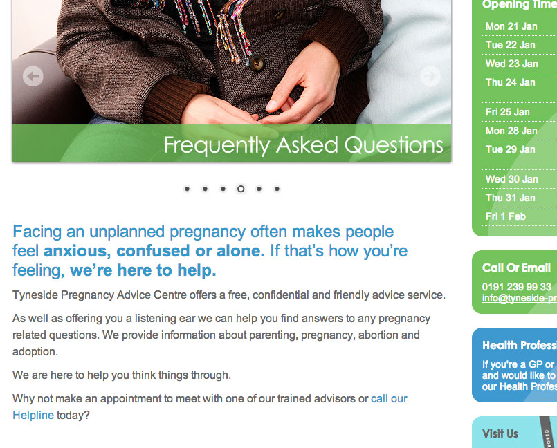
- Responsive home page carousel
- Adaptive font sizes
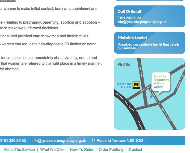
- Sidebar elements moving into the footer as links
- Simplified header graphics for smaller devices